- What is Color Temperature?" href="#span-style-text-decoration-underline-what-is-color-temperature-span">What is Color Temperature?
- When to choose Warm White (2700-3100K) :
" href="#span-style-text-decoration-underline-when-to-choose-warm-white-2700-3100k-br-span">When to choose Warm White (2700-3100K) : - When to choose Cool White (5000-6500K) :" href="#span-style-text-decoration-underline-when-to-choose-cool-white-5000-6500k-span">When to choose Cool White (5000-6500K) :
- When to choose Neutral White (3900-4200K) :" href="#span-style-text-decoration-underline-when-to-choose-neutral-white-3900-4200k-span">When to choose Neutral White (3900-4200K) :
- Conclusion :" href="#span-style-text-decoration-underline-conclusion-span">Conclusion :
Today we'll explore the more meaningful aspects of color temperature choice, and how color temperature choice can affect the visual appeal, mood, and color reproduction of any space.
What is Color Temperature?
First - as a refresher - a note on color temperature values, which are measured in degrees Kelvin, and range from around 1700K (very, very warm) to 9500K (very, very cool). Why degrees Kelvin?
A simple way to think about color temperature is to imagine a piece of metal being heated. As it is first heated, it emits invisible infra-red light, or heat. As it gets even hotter, it begins to glow a soft red, or orange - and we're now in the lower range of color temperatures. As the heat increases further, the red or orange gives way to yellow, and eventually white. Photographer Mike Browne explains it well.
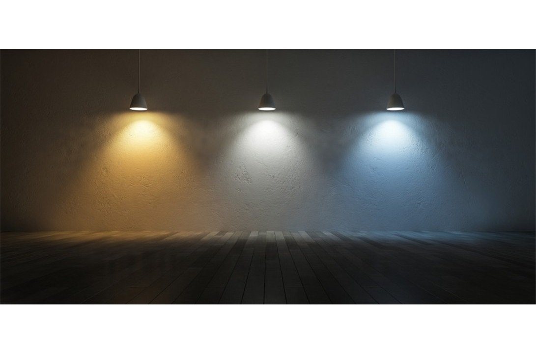
You'll find varying descriptions for whites of different color temperature, but at HitLights we broadly define whites in the 2700-3100K range as 'warm white', those in the 3900-4200K range as 'neutral white', and those in the 5000-6500K range as 'cool white', all of which are shown below.
Warm White (~3000K), Neutral White (~4100K) and Cool White (~5000K)

Note that there are no agreed-upon standards for what color temperatures 'warm white', 'neutral white' and 'cool white' represent - so what we might call 'warm white', another manufacturer might call 'soft white', or 'candle white'. When selecting lighting, be sure to refer to color temperatures (which are science) instead of descriptors such as 'warm white' (which are marketing).
When to choose Warm White (2700-3100K) :

The first form of artificial light that humans mastered was fire, with various evidence putting the earliest use of fire by our ancestors at up to a million years ago. If you've ever sat by a fireplace or a campfire and felt warm and cozy, that's thanks to millennia of adaptation to the use of fire for light, for warmth, and for cooking. This adaptation is so hardwired into our brains that mere images of fire can elicit feelings of warmth and comfort in people. Later in human history, open fires were replaced by fireplaces, then candles, and finally the venerable incandescent light bulb - all of which produce warmer whites.
Warm whites are therefore an ideal choice for making people feel at home, which is why they are the most common choice for residential use, or for when trying to capture that 'homey' feeling. If you've ever been to a bed and breakfast hotel or shopped or eaten at an 'old-timey' establishment, you might have noticed warm white lights making those places feel a little more comfortable. Perhaps you did not notice it at all, not consciously - but your wallet probably did, because in a cozy, comforting, and home-like environment, you were more likely to trust, spend, and tip more.
On a more practical level, warm whites accent wood and bricks well, and make reds, yellows, and oranges more vivid while muting greens and blues. Warm white may not be an appropriate choice in business environments where productivity might be affected by employees getting too comfortable, or in settings where accurate color reproduction is necessary (more on that when we talk about Neutral White).
When to choose Cool White (5000-6500K) :

Cool white is sometimes called 'daylight' - and with good reason, as the hint of blue in lights above 5000K or so evokes the brilliant sun and blue skies of a clear, cloudless day. Cooler whites, then, tap into our instinctual affinity for being outside and the freedom and possibilities that come with it. Sunlight on your skin causes D3 vitamins to release into your bloodstream, actually making you happier.
Cool whites can help add a sense of life, excitement, and energy to spaces that warm whites lack. While they do have a small amount of blue in them, it's not as noticeable as the orange/yellow in warm whites, meaning that cool whites also do a pretty good job displaying colors.
Cool whites are popular in office buildings, where this lighting can serve as an enliven-er and morale improver - particularly if the space does not have a source of natural light, such as windows or skylights. They are often used by retailers to 'liven up' or provide energy to what might otherwise be a dull or uninteresting display. Unlike warm whites, which often work well at subtler outputs, cool whites tend to provide better results when they are bright, making your products pop!
Cool whites tend to work less well with wood and bricks than warm whites, as the natural yellows and reds in those materials are rendered less visible by the blueish tints of the cool white. This makes cool whites less useful in residential applications, though they can be used with great effect in areas with neutral (black, white, grey) or cool (blue, green) colors.
When to choose Neutral White (3900-4200K) :

Neutral white light is a relatively modern invention - as it wasn't until lighting technology matured in the mid-1900s that color temperatures could be specified to be anything other than the traditional warm white of incandescent light bulbs. Unlike Warm White and Cool White, there is no 'natural' use for lights in the neutral white range.
Being neutral, however, does have its advantages. Unlike cool and warm whites, neutral white reproduces all colors equally well, so it's the ideal (some might say 'only') choice for displaying merchandise, art, or photography. You'll find neutral whites used almost exclusively in art galleries and museums, and anywhere that accurate color reproduction is important. Performing detailed or high precision work can also be easier under neutral white lighting.
Because warmer and cooler lights accentuate and mute certain colors, neutral whites are also preferred in spaces that feature many colors - where the blue of cool whites and the yellow/orange of warm whites would brighten certain colors while darkening others. A high-quality neutral white is a great choice to make sure branding materials display logos and colors accurately.
As the name implies, Neutral White can be a little, well, neutral - so if you're creating a space with a specific mood in mind, then neutral white lighting can make space feel a little clinical, rather than inviting, or exciting - and if you've gone to the trouble in making a space feel a certain way, then having a light source that merely provides illumination alone as opposed to being part of that space can feel like a letdown.
Conclusion :
A good color temperature choice can be the final, victorious touch on your project, while a poor one can make it fall flat, and in some cases even drive people (maybe even customers!) away. HitLights has LED light strips available in all three categories of color temperature so that you can choose the right product for your project.
Be sure to think hard about what you're trying to accomplish in your space, get in touch with our customer service team if you're having trouble and we'll help you out!
Color temperature is just one small factor in choosing the right LED strip light for your project - our free eBook, titled 'How to Choose LED Strip Lights' is an ideal guide in the next stage of your LED lighting journey.